GET
A furniture store built around interior scenarios and decision logic.
Together with the GET.ru team, we combined functionality, design and inspiration to help furniture buyers create their dream interiors.
Challenge
Today, you can buy anything online — from everyday household items to luxury goods. But the abundance of stores and marketplaces often makes choice harder: endless similar products, different sellers, and little guidance.
Furniture is especially sensitive to this. People want a cozy, beautiful home and often feel drawn to a certain style, but do not know which pieces, textures and details will bring it together.
Online, buyers rely on digital traces: reviews, ratings, descriptions and detailed photos. Few brands go further — inspiring customers, guiding them through interior styles, and helping them find exactly what fits their idea.
GET.ru, a project by a leading furniture factory, focused on this need. Our task was to propose a strategy for a modern furniture eCommerce platform that combines functionality, thoughtful design and inspiration — helping customers create the interior they have in mind.
Awards

Furniture and interior: bronze

Honorable mention
Стратегия
To create something truly distinctive, we reimagined what a furniture store could be.
Customers are not simply looking for an item with the right parameters. They are looking for a piece that fits their interior — in style, scale, and quality. So we built the strategy around the interior, not just the product: the customer journey starts with the space the item will become part of.
Project concept
During the discovery phase, we identified the criteria that could increase engagement, conversion, and overall revenue. Based on this data and the needs of the target audiences, we developed:
- positioning for end customers;
- positioning for suppliers;
- the core service mechanics;
- information architecture;
- functional requirements for the online store;
- functional requirements for the supplier account.
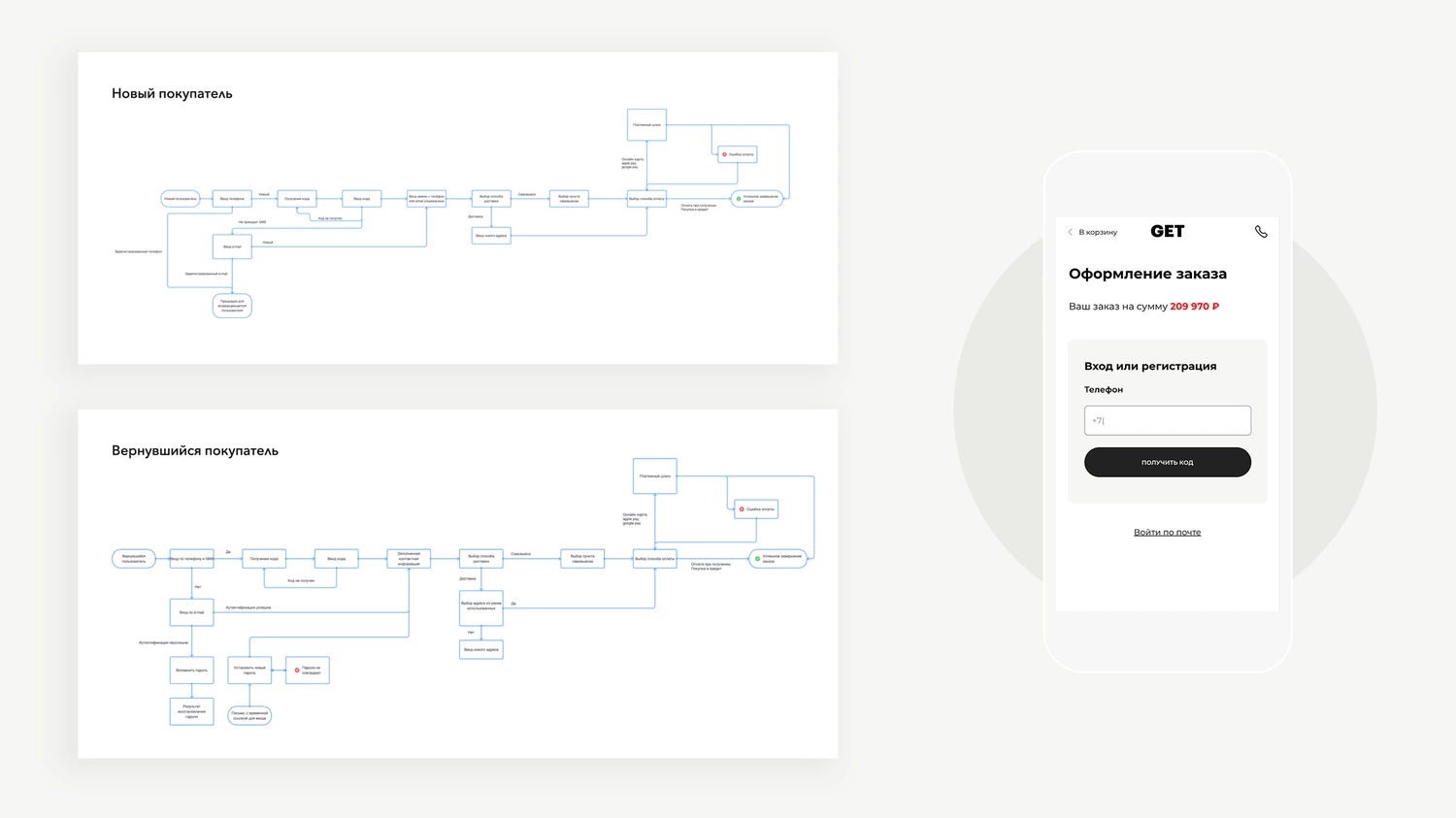
User behavior analysis
Together with the GET.ru team, we defined the target audiences and mapped 14 common user journeys in an online furniture store. We then prioritized the journeys that best reflected customer motivation, needs, and pain points. Our goal was to improve behavioral signals through an intuitive interface and relevant content adapted to each customer’s needs.
Information architecture
The catalogue architecture had to be not only convenient for users, but also capable of supporting organic traffic growth from search engines. To achieve this, we designed a structure for catalog and content clusters that would expand the project’s SEO potential.
User experience design
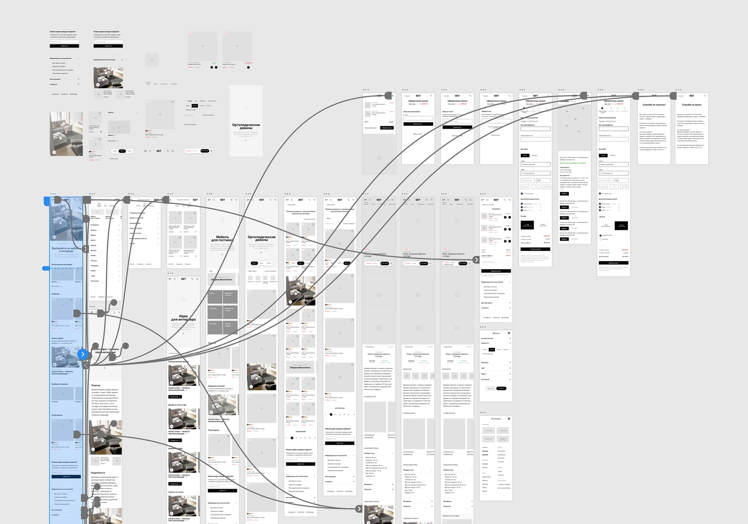
Before moving on to UX design, we created a map of functional references, reviewing 37 notable furniture websites and their approaches to navigation, product presentation, search, sorting, and checkout.
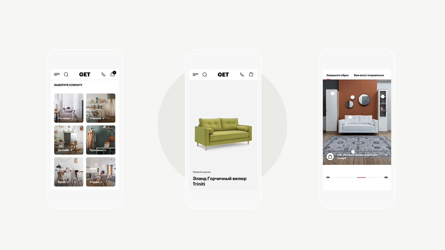
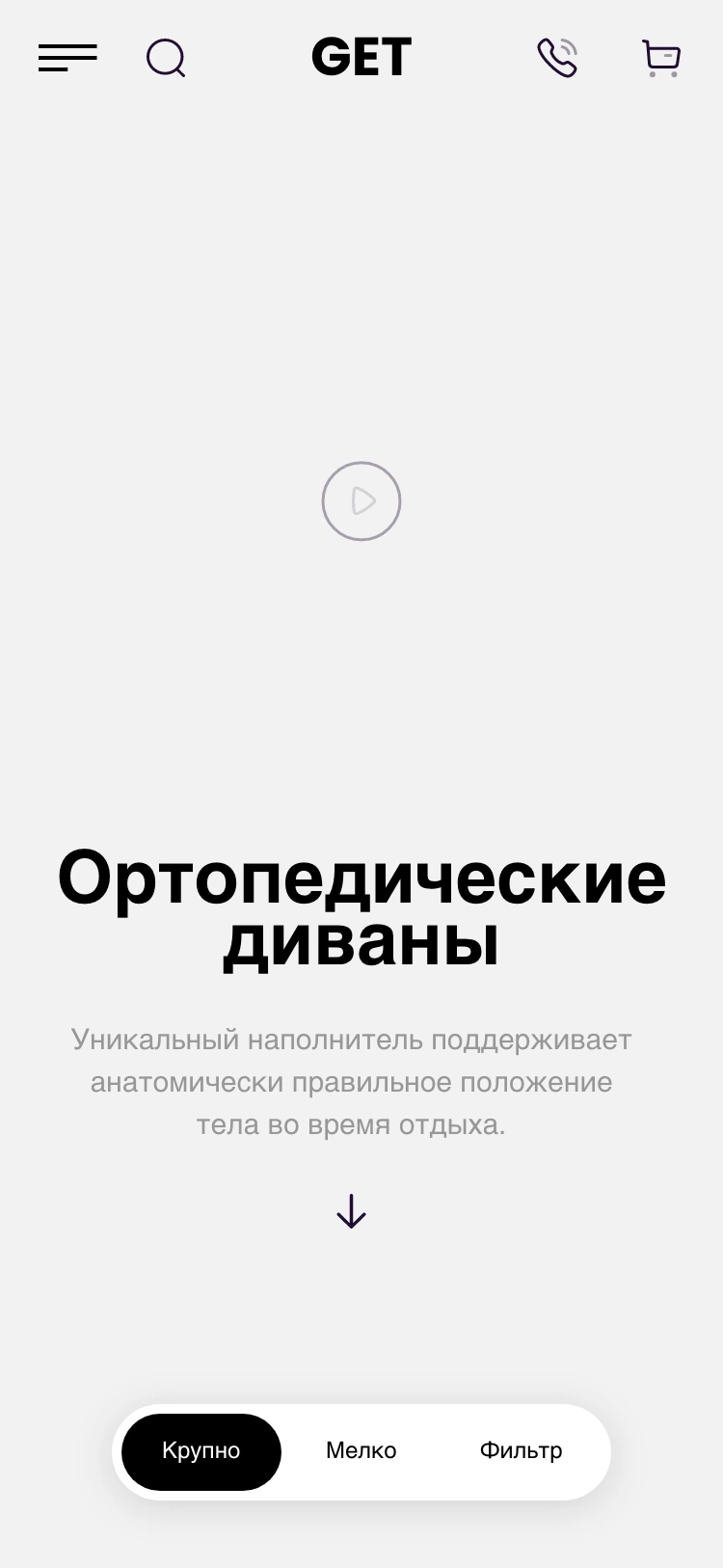
The UX design focused on the mobile version, as more than 80% of customers search and shop using mobile devices. Over a five-week design and testing phase, we developed an interactive high-level prototype with 25 key screens covering all core product functions.
Product selection mechanics
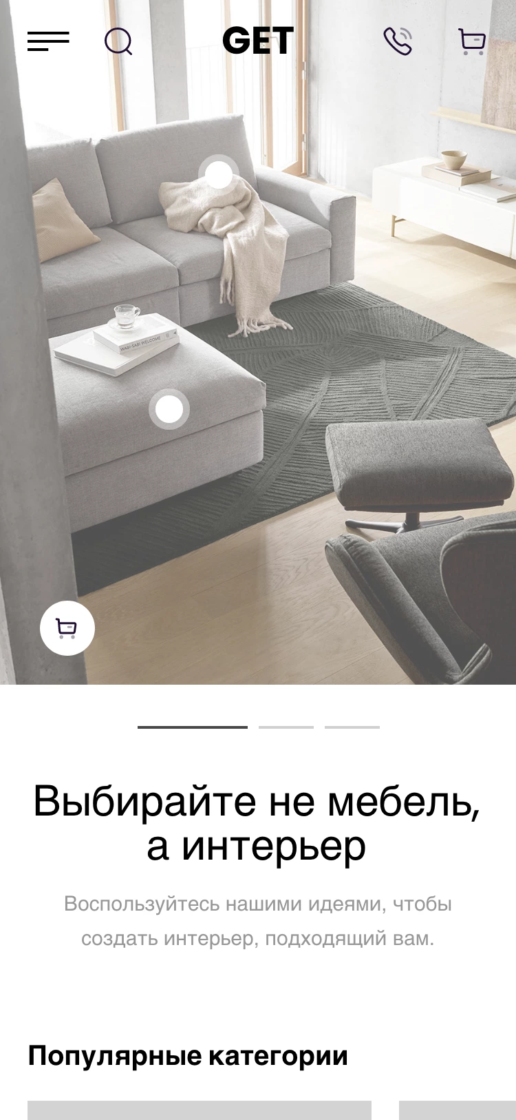
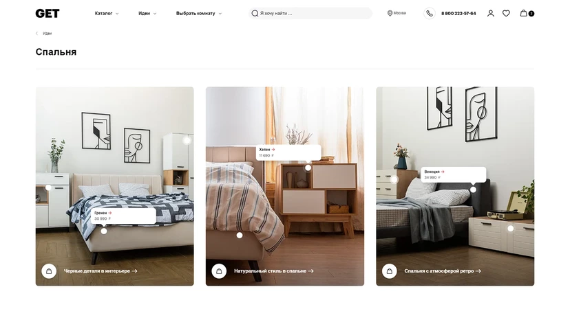
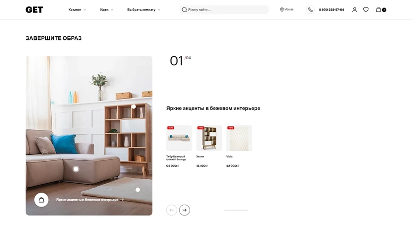
Today’s customers look for inspiration on websites and apps such as Pinterest and Telegram, collecting well-curated interior design references. We proposed using curated content — interiors featuring products available on GET.ru — with the ability to shop directly from an image.
The idea itself is not new, but the key feature of our approach was to give priority to photo and video content over text. At the same time, the Ideas section was designed to support a cluster-pillar structure, where one main publication covers a broader topic and links to a set of individual interior ideas that explore it in detail.
We provided for both simple “shop the interior” content and more in-depth editorial materials, such as reviews, comparisons, and descriptions of interior design projects.
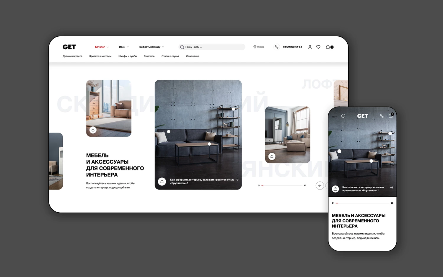
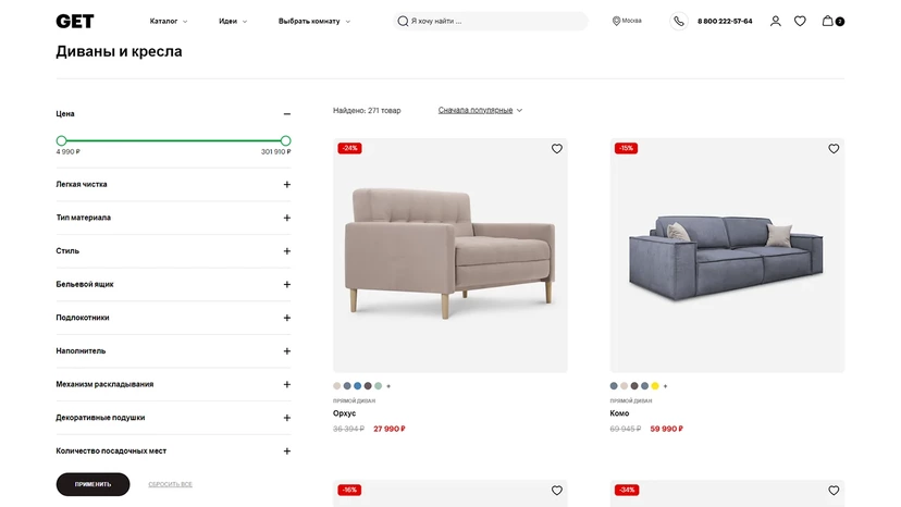
Catalogue modes
A key feature of the catalogue is its ability to adapt to the customer’s navigation style. The catalogue works in three display modes, which can be quickly switched using a fixed interface control.
Large: this mode shows larger product images, covers, and extended information. Promotional content and products shown in interiors can also be embedded into the product grid.
Compact: all additional information is removed and product cards are reduced in size, making it easier to choose visually from a large list of products.
Filter: this mode includes a fixed panel with product attributes that can be used to narrow down the selection.
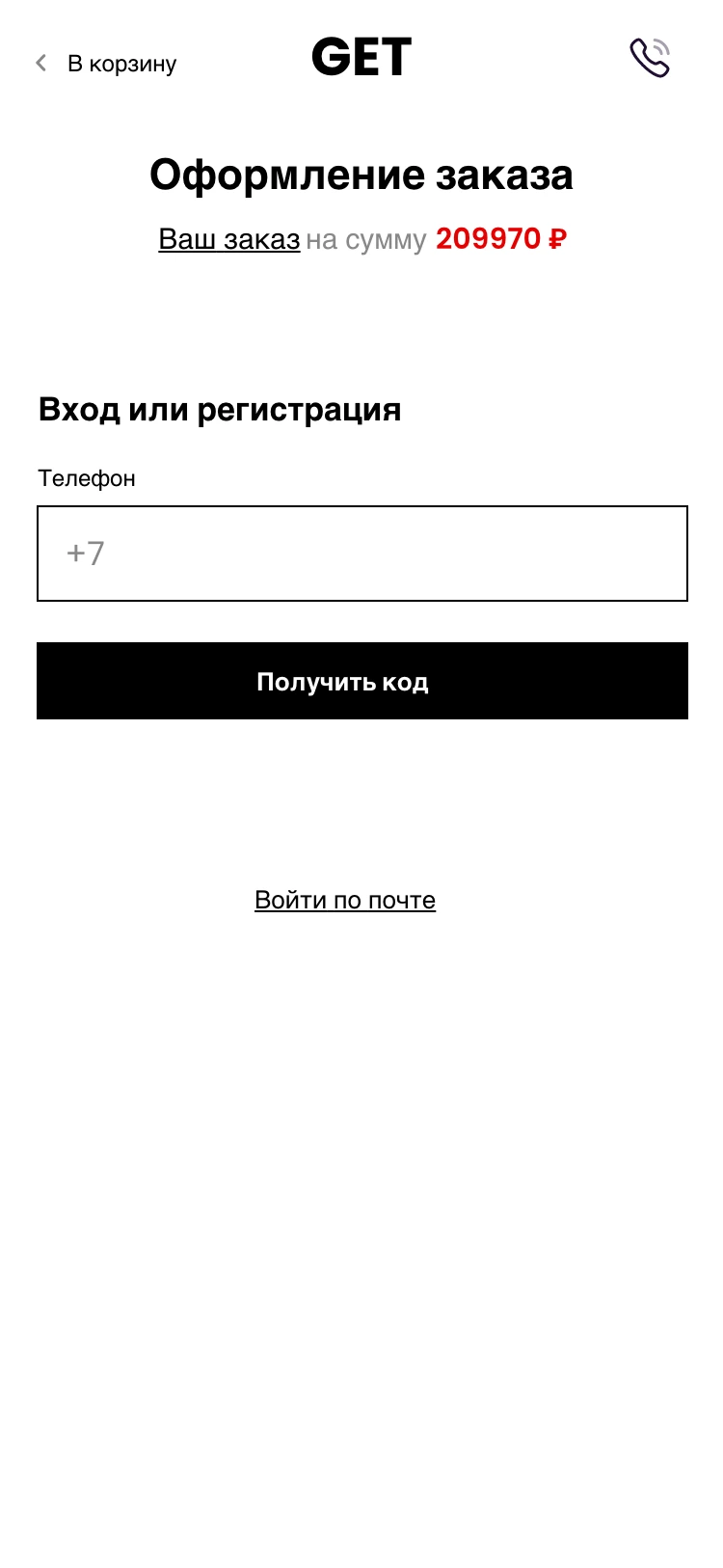
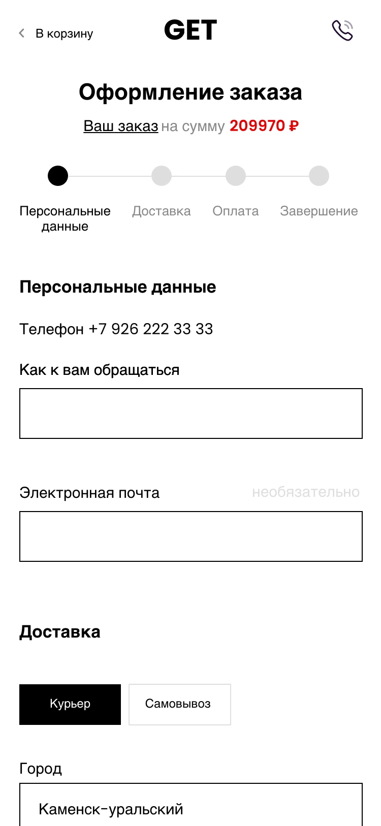
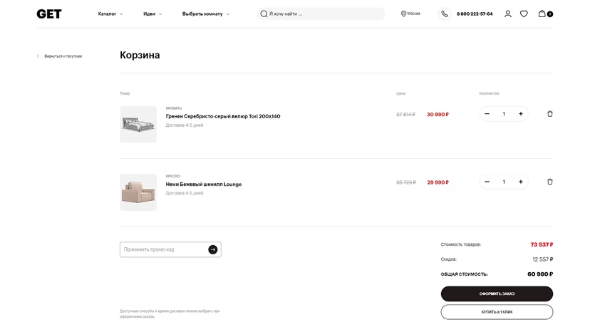
Improved purchase flow
Today’s customers expect the buying process to feel effortless. We analyzed user behavior in existing projects and identified the pain points that make checkout more difficult. This helped us design seamless scenarios for both new and returning customers, covering key situations:
- the customer is ready to provide order details during checkout;
- the customer wants to be contacted to complete the order;
- the customer wants to pay online or offline;
- the order requires delivery or in-store pickup.
We also designed a separate scenario for cases when the SMS confirmation code does not arrive. For returning customers, the interface can suggest previously used contact details, delivery addresses, and payment methods.
DESIGN AND FRONTEND
The platform’s visual language was designed to keep the focus on the product while drawing users into interaction with the interface.
We developed the UI components, typography, and a detailed colour palette to bring GET.ru’s key brand values to the foreground: modernity, minimalism, and expertise.
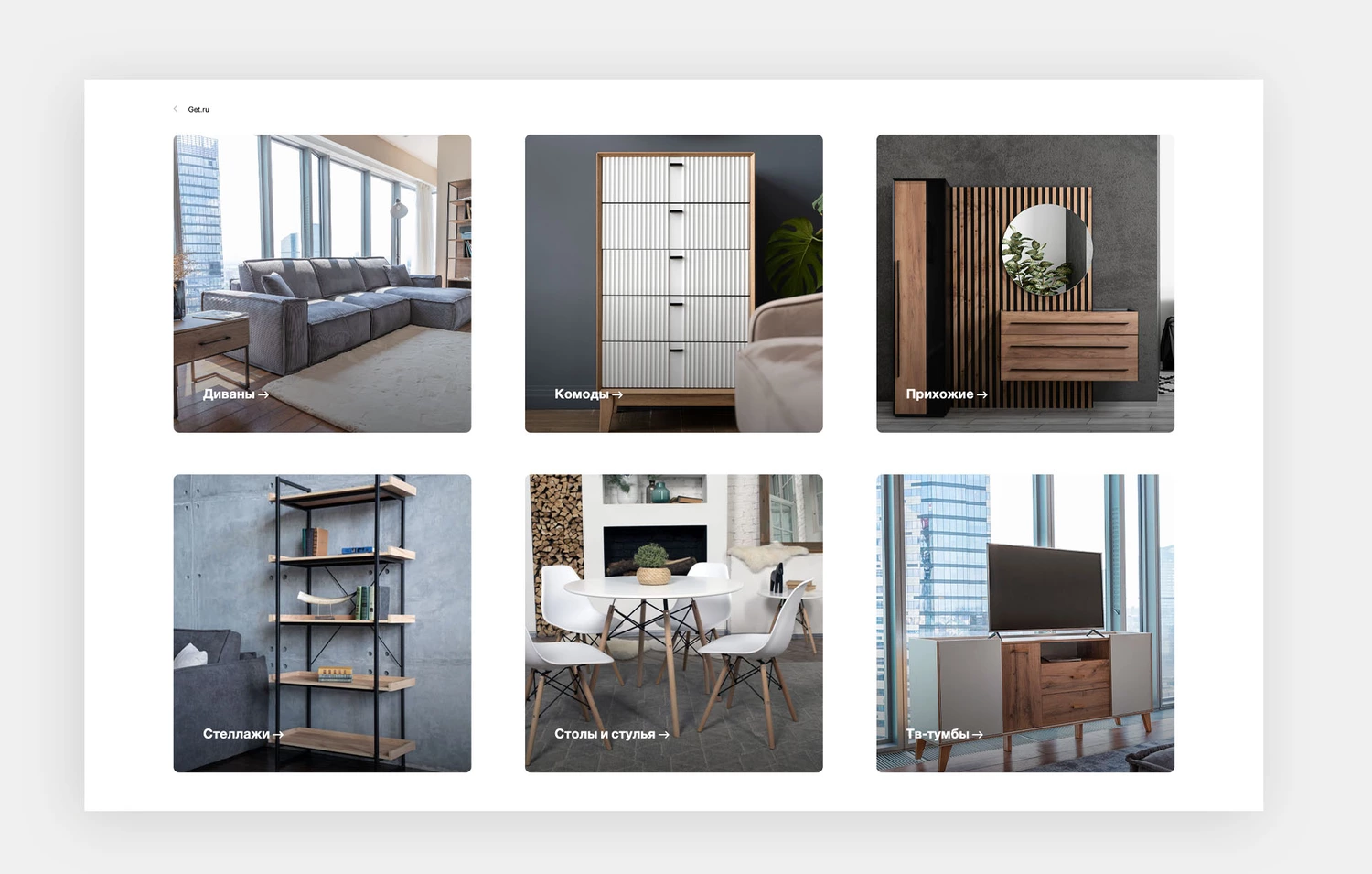
We selected category illustrations to preserve the visual consistency of the online store and developed content design guidelines.
In total, we designed 135 page templates.
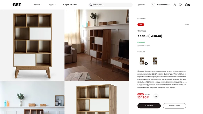
Product
We designed several product page variations:
- simple product;
- product with variations;
- complex product consisting of several elements.
The platform features a wide range of product types. We designed the layout so that product cards remain informative and visually tidy, regardless of the number of specifications and product-specific details.
Style-based recommendations
We encourage customers to complete the look, helping them create a room in a consistent style. The site suggests options based on several interiors where the viewed product is already used.
For product recommendations, we reserved space for:
- similar products by type and purpose;
- products in the same finish or upholstery;
- products frequently bought together.
View the product from every angle
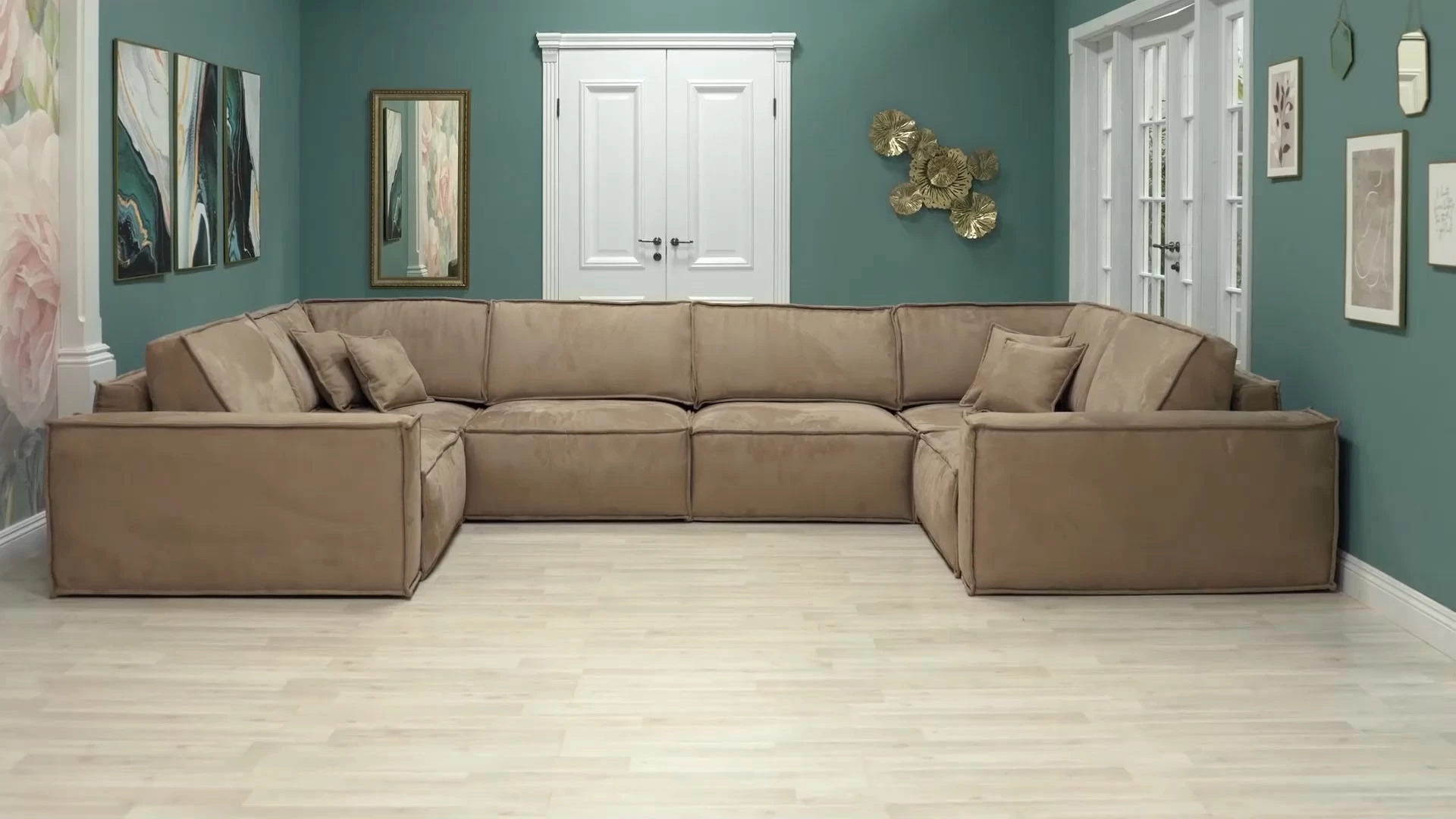
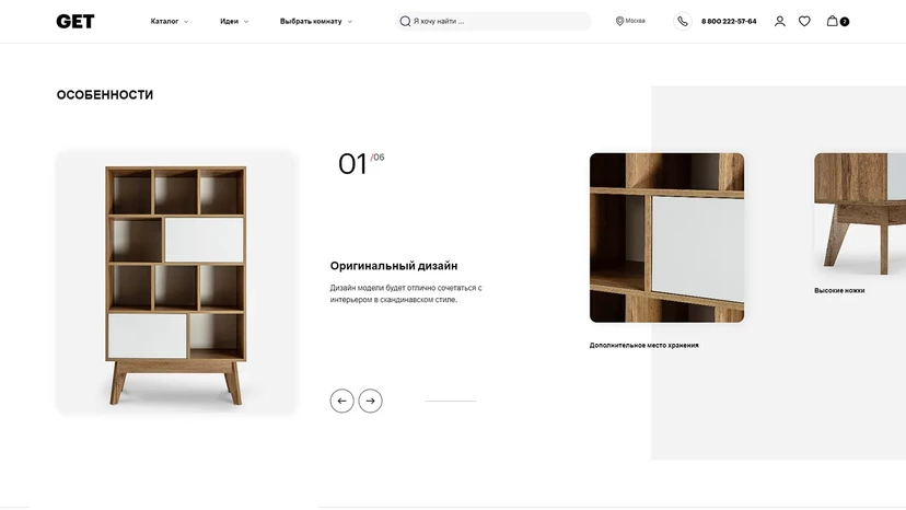
As a distinctive feature, we added the ability to rotate the product left and right — giving customers the feeling that they can literally “turn” it and view it from every angle. The animation is assembled from 12 images: the product is photographed on a rotating platform, then the processed images are combined using a custom script.
All images are delivered through the HTML
picture element, so mobile users receive more compressed
images than desktop users.
- We automatically detect WebP support and serve images in this format instead of traditional JPG, reducing file size by around 50%;
- the animation block loads after the page is rendered, so users do not have to wait for all images and scripts to load before they can start browsing.
Configurable product sets
Some product items consist of several elements that can be purchased separately or together and combined in different ways — for example, modular sofas or living room sets. Customers can adjust the set by changing the number of elements, adding items, or removing them.
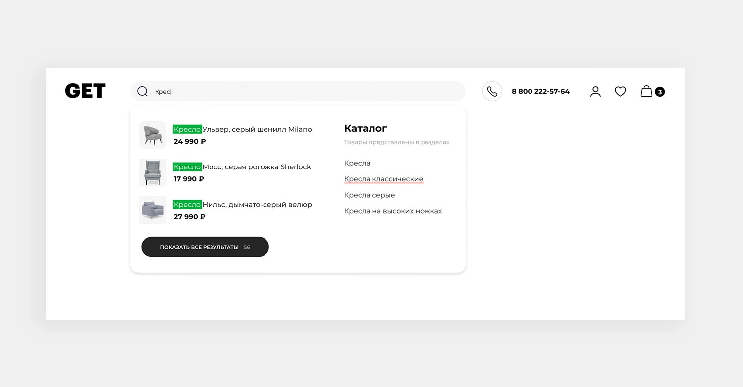
Search
For a large catalogue, search is one of the main ways to find the right product. We designed a tool that brings together proven search best practices:
- visual suggestions appear as users type their queries;
- suggestions include not only products, but also the categories they belong to;
- search results can be filtered by price and sorted by relevance or other criteria.
Editorial merchandising in the product grid
Content tiles in the catalogue product grid make it possible to integrate different types of content, allowing the GET.ru team to feature interior recommendations, selected collections, promotional offers, and popular filters. These modules work as visual accents within the overall flow of product listings.
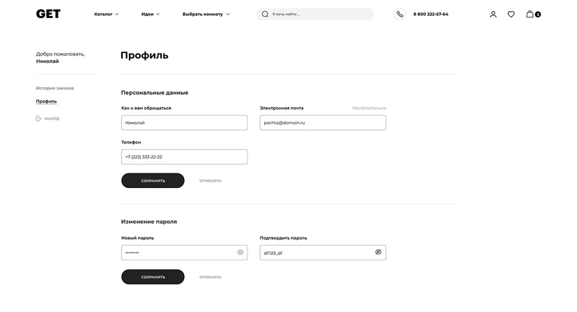
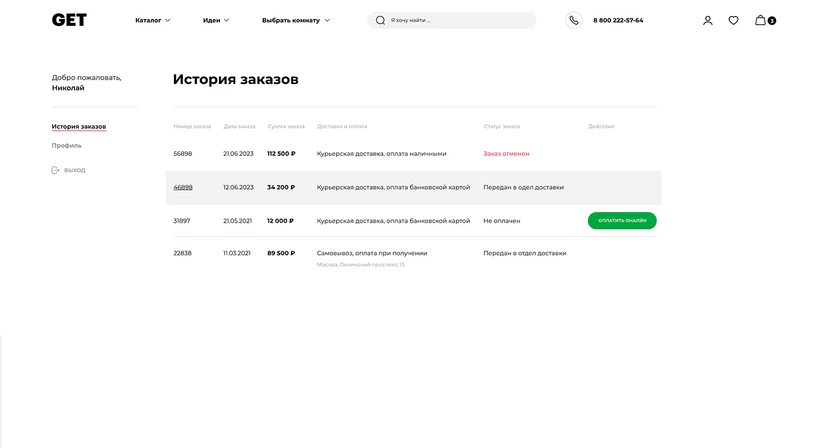
Customer account
The customer account is designed as an optional service layer. It allows users to view their order history, pay for purchases, and check order status.
At the same time, the account is not required to complete a purchase: the entire order flow works without additional user authentication. For example, order status updates can be sent via SMS.
Mobile version
As the version most used by customers, the mobile experience includes the full functionality available on desktop. We also paid special attention to interface speed, deferred loading, and optimized animations.