CORDÃO DE OURO
a capoeira school website that helps people take the first step
We've developed a new website for the renowned capoeira school Cordão de Ouro. The website helps newcomers take their first step into the world of capoeira.
Challenge
Cordão de Ouro is a famous school for capoeira, founded by mestre Suassuna and mestre Brasilia in 1960.
Our goal was to make a simple and attractive website for the Russian center for capoeira. The website aimed to attract people looking for a sports class close to home, either for themselves or for their children.
Awards & Recognition

Honorable mention
Mobile Excellence
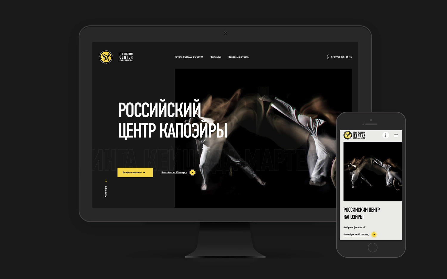
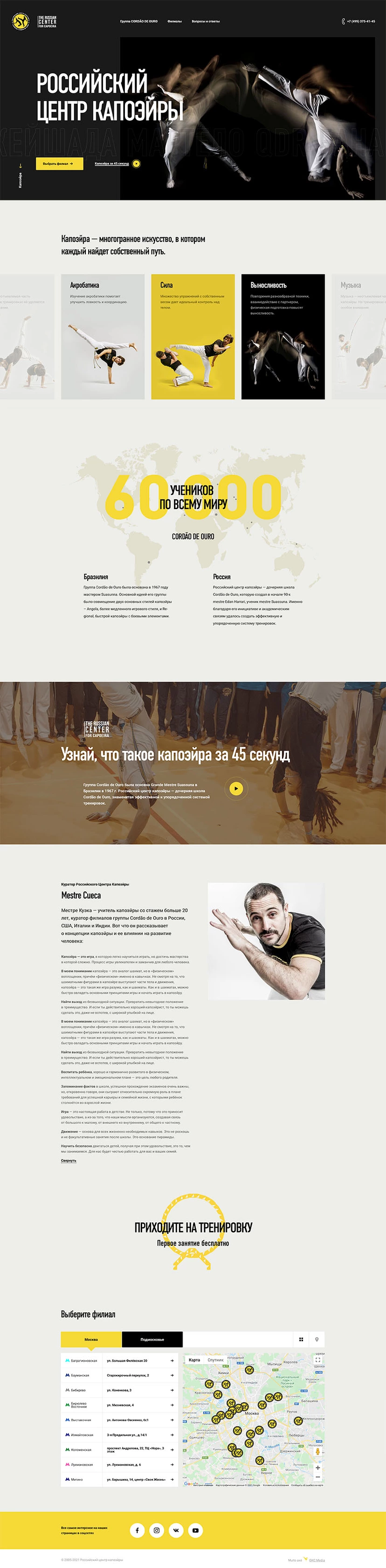
Cordão de Ouro is a global group, but every branch works for a specific region. That's why when designing the website's structure, we focused on the convenience of choosing a school by location.
Approach & Process
We analysed users' behaviour using data from the old website and typical questions asked by phone. This shaped the way we structured the website pages around the key questions:
- What is capoeira?
- When and where do classes take place?
- Who are the instructors?
- How much does it cost?
- How do you start?
We created a dedicated landing page for each branch and connected them through a central hub. This structure solved three tasks at once:
- A landing page for the whole Russian branch;
- the ability to search for the nearest local branch;
- landing pages for each local branch in Russia.
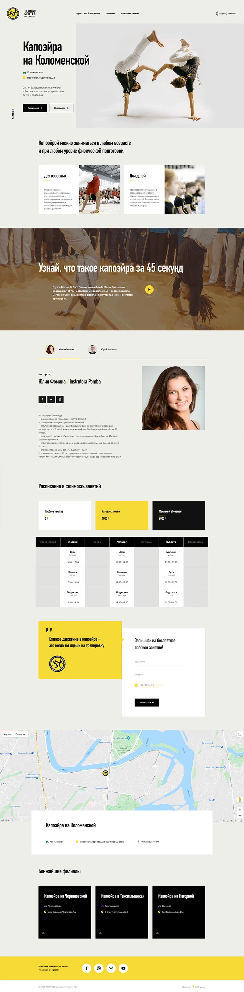
What is capoeira?
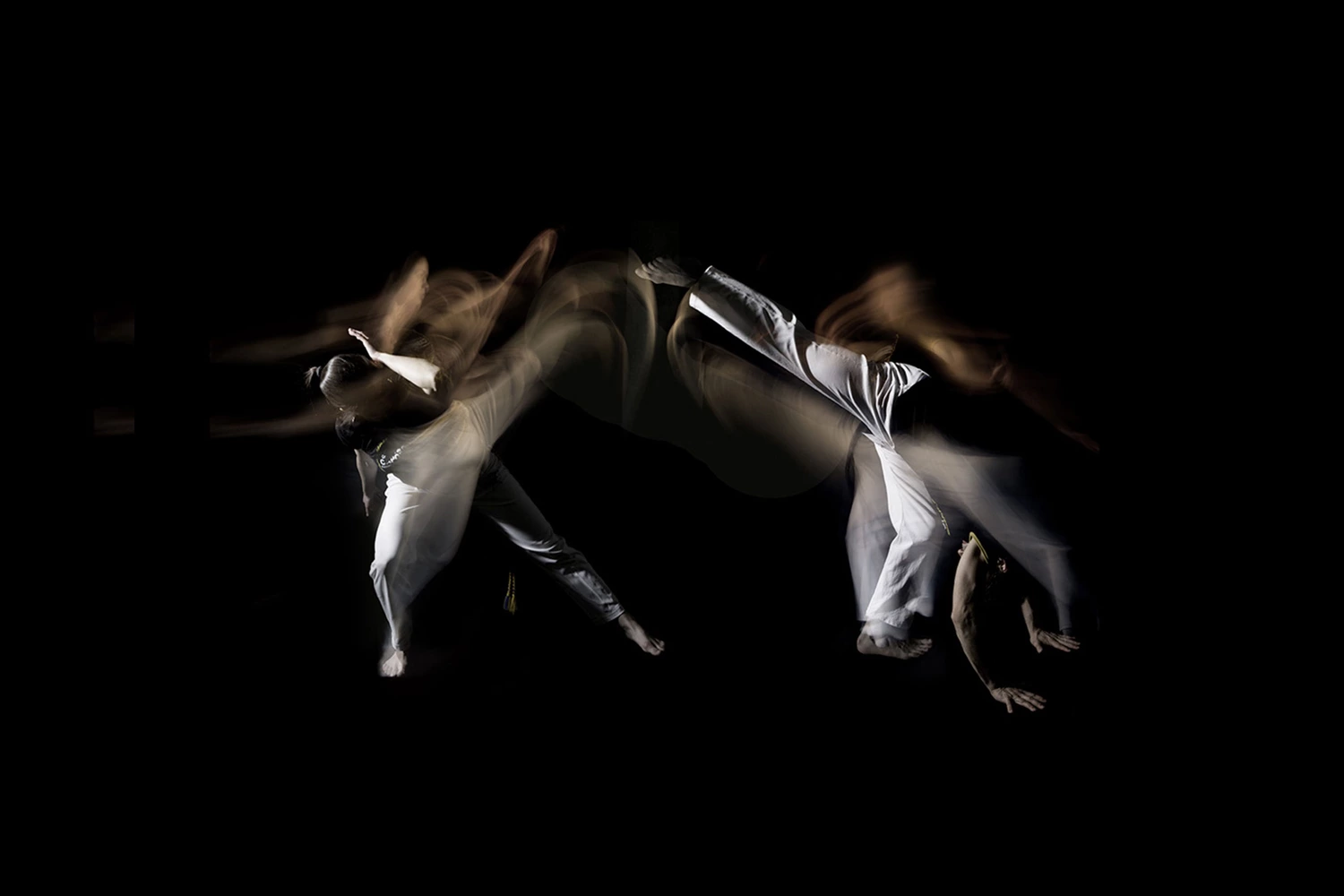
If you google what capoeira is, you'll get standard answers explaining that it's a type of afro-brazilian martial art, dance, music, and acrobatics. Technically correct, but not very easy to understand. In fact, capoeira is an experience that you need to try for yourself in order to understand it.
We focused on a visual representation of the different aspects of capoeira aspects such as acrobatics, martial arts, and music, and avoided long annoying texts. We used photos, footages, and a video story "Find out what Capoeira is in 45 seconds".
Find a class
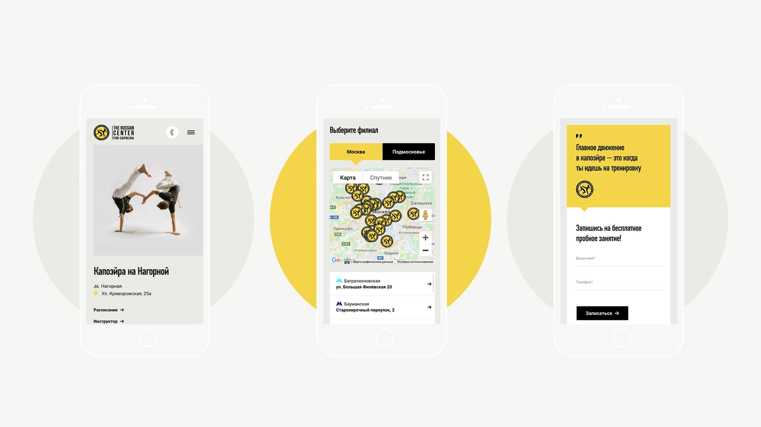
We paid special attention to the map of branches. The user can select the desired branch from the list or tap it on the map. When developing the map, we took into account the differences in behaviour and navigation on a desktop as compared to a smartphone.
Mobile experience
We knew that more than 80% of users access the website from their smartphones. That's why we developed the website starting from a mobile experience. Adaptive versions have been created from smaller to larger screen sizes. To keep performance high, we used tricks such as:
- Preloading of local fonts;
- priorities between preloading and deferred loading of scripts and styles;
- lazy loading of defined images;
- serving static assets with an efficient cache policy.
Features
- A website structure designed for ad campaigns for branches
- Front-end animation effects
- High-performance for mobile users
- Customized Bitrix CMS platform
- Database for user's leads
- Google Analytics and Yandex Metrika